In this article:
Improve Conversions Overview
The Improve Conversions dashboard provides a series of visuals to help you understand how your storefront is performing and where drop-off occurs. Blended with marketing channel data, the dashboard also illustrates which channels and campaigns are driving the highest quality traffic. To see the Improve Conversions dashboard, click here if you are signed into Cart Console or navigate to Unified Analytics > Convert > Improve Conversions:
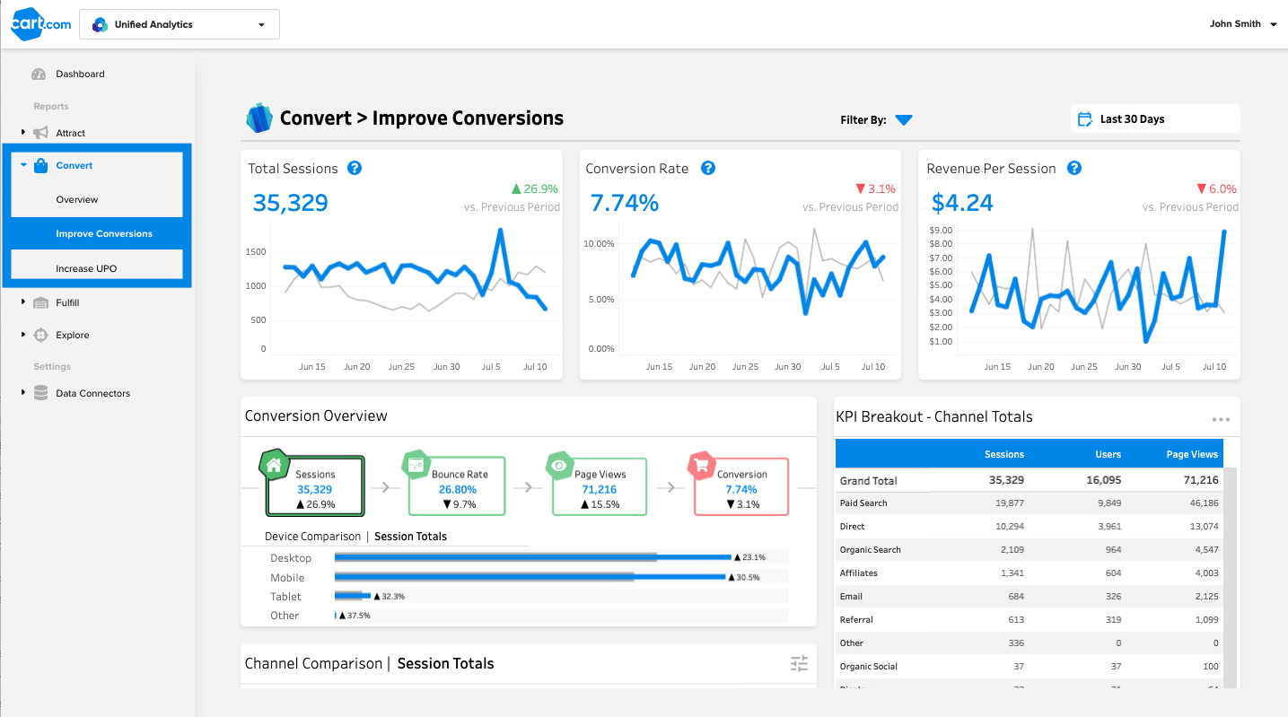
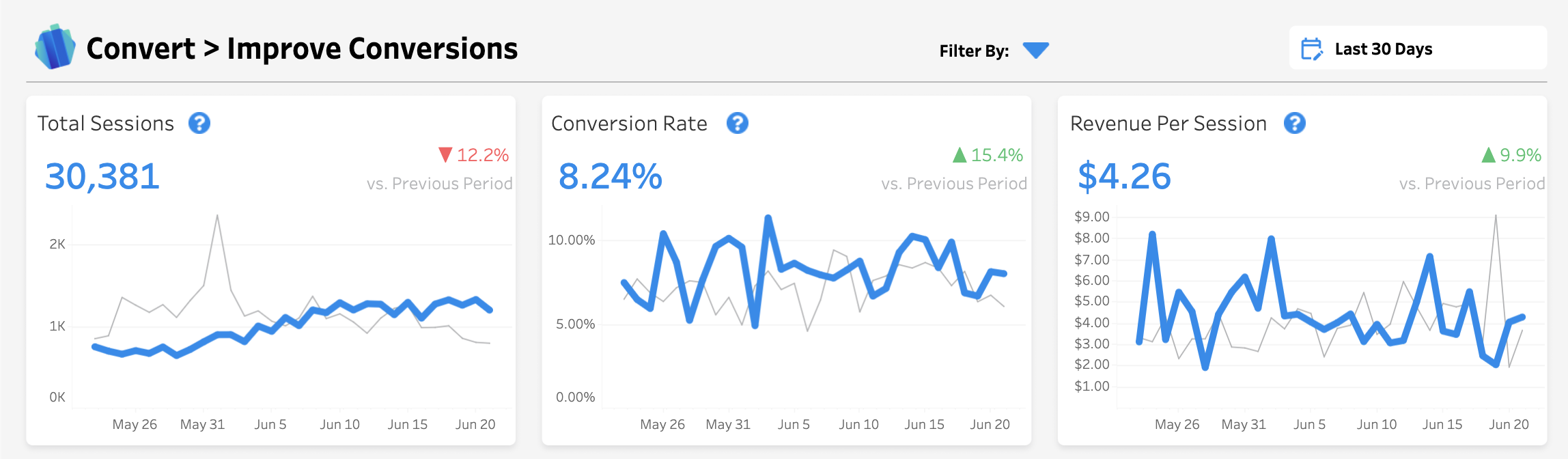
The top row of charts on Improve Conversions give a high level view of how your most important site KPIs are performing relative to the previous date period. Ideally, all three of these metrics should be as high as possible:
-
Total Sessions: A session is a group of user interactions with your website that take place within a given time frame (a visit). A single session can contain multiple page views, events, and transactions. This figure plots all sessions over the time period.
-
Conversion Rate: This is the percentage of users that visit your store who make a purchase in the specified time period.
-
Revenue Per Session: Also referred to as Revenue Per Visit, it is the amount of money generated each time a customer visits your site. It is calculated by dividing the total revenue by the total number of sessions on your site.
Drop-off Root Cause Analysis
The bottom portion of the dashboard gives you all the tools you need to understand where users are dropping off and how those trends differ across devices, campaigns, and channels:
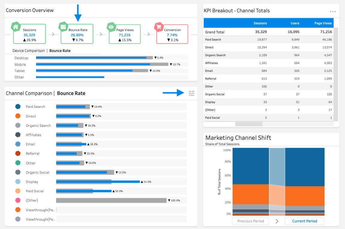
In the Conversion Overview, you can see your key conversion metrics metrics laid out in the customer journey to help you identify where drop-off is occurring. By clicking the box for Sessions, Bounce Rate, Page Views, or Conversion within the Conversion Overview, you will filter the rest of the views so you can compare performance for that metric across devices and channels.
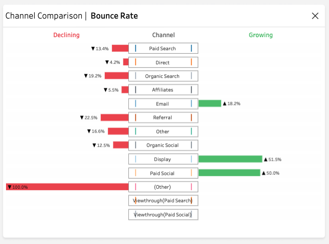
The Channel Comparison view shows the metric selected in the Conversion Overview graphed by channel, comparing current performance (blue bar) with past performance (grey bar). Clicking the icon at the top right of the Channel Comparison will switch the view to show the growth or decline for the selected metric across channels: