In this article:
Fulfillment Analytics Overview Tab
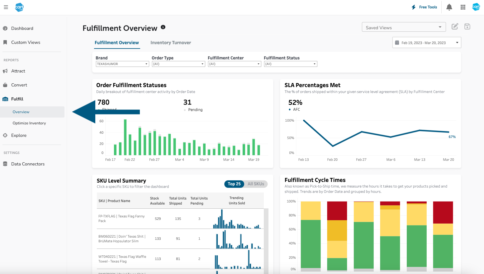
The Fulfillment Overview dashboard has been redesigned with a focus on fulfillment center operations, allowing brands to drill into performance over time and across SKUs against their service level agreements (SLAs). It contains a series of charts to help you benchmark how your fulfillment operation are running and hone in on ways to improve efficiency across warehouses and the customer experience. To find the Fulfill Overview dashboard, you can click here if you are signed into Cart Console or navigate to Unified Analytics > Fulfill > Overview.
Fulfillment Overview Top Row
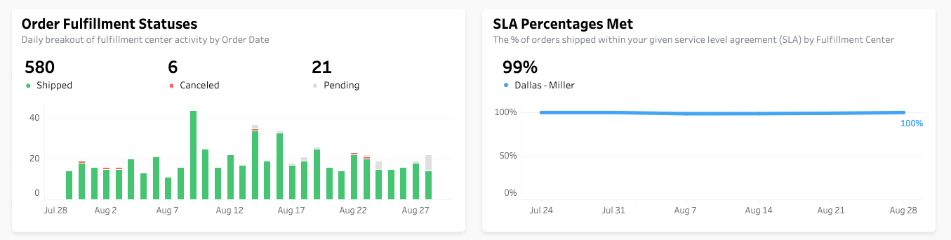
The Order Fulfillment Statuses chart features a daily breakout of order statuses over time, making it easy to monitor for older orders stuck in a pending state. The SLA Percentages Met figure shows the percentage of orders shipped within a brand’s service level agreements over time.
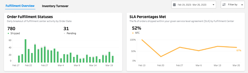
It is customized with bespoke logic based on the customer’s contract to give transparency into how Cart is performing against its promises. If a brand uses multiple FCs, each will appear as a separate line.
Fulfillment Overview Bottom Row
The Fulfillment Cycle Times chart is another new addition, displaying the weekly pick-to-ship times of orders over time. Pick-to-ship (or cycle time) measures how quickly an order is sent to a customer after their order is placed, a key determinant of overall delivery timeline and the likelihood of a customer to order again.
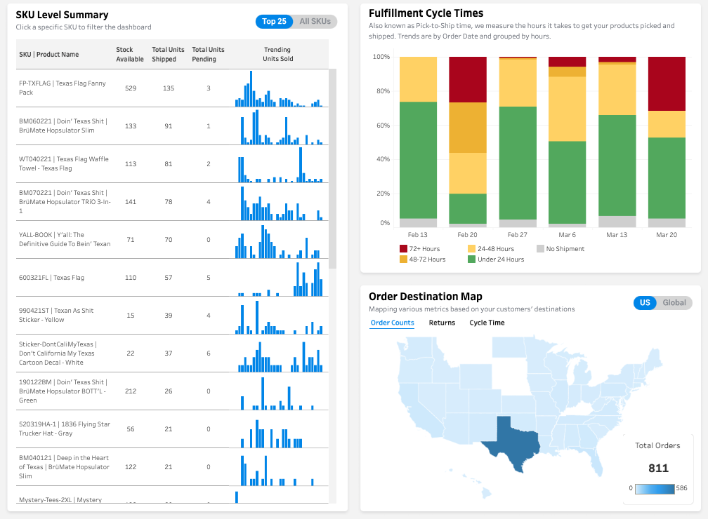
The SKU Level Summary and Order Destination Map charts can be used to filter the dashboard to conduct SKU or region-specific analysis on volumes, returns, and cycle times.
Key fulfillment metrics within geographic maps:
-
Shipped Orders - Total number of orders shipped during the time period. The higher this is, the more product you are delivering.
-
Total Returns - Total number of orders returned to the warehouse. High or increasing return numbers may signal customer dissatisfaction.
-
Fulfillment Cycle Time - Average number of days from a customer's order to the day the order is packed and shipped. It does NOT include shipping days in transit. Lower Fulfillment Cycle Times indicate better efficiency and improved customer experience. Hover over the Question Mark Icon to see how your Fulfillment Cycle Time is trending over time.
How to Identify Causes of Fulfillment Inefficiency
The dashboard is designed to help you identify the root causes of Fulfillment KPI changes by blending location and SKU-level data from your orders.
Location Trends
The map examines how key metrics differ across various regions that your customers order from. You can use the switch in the top right corner of the graphic to toggle between country-specific and worldwide data.
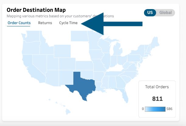
The map’s shading represents the magnitude of the selected metric for each region (darker = higher value). To switch which metric is graphed, click on one of the three KPI tabs right above the map. Now, you can drill in on which regions are responsible for the highest orders, cycle times, and returns.
SKU-Level Analysis
Aggregate location trends alone can be helpful in making decisions on inventory distribution and shipping, but SKU-level trends allow you to fine-tune your decisions even more precisely. The SKU Level Summary table shows your highest volume SKUs during the time period. By clicking on a row, you will filter the dashboard to show data only for that SKU:
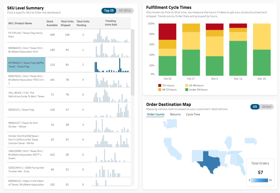
Now, you can see regional performance specifically for that SKU. Armed with these insights, you can create inventory distribution and shipping process improvements for your top-selling products to drive efficiency in your fulfillment operation.
Inventory Turnover Tab
A new tab, Inventory Turnover, has been added to the Fulfillment Overview to help customers improve their ITR to drive profitability.
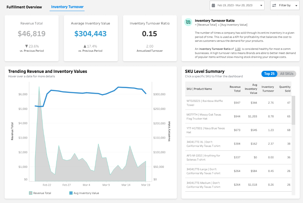
About the Inventory Turnover Ratio
Inventory Turnover Ratio (ITR) is the number of times a company has sold through its inventory in a period of time (revenue total divided by average inventory value). The healthy measure for most ecommerce businesses is ~1 within a 60-day period, meaning that their inventory matched demand perfectly for that period. Similarly, an ecommerce business should expect to turnover its inventory 6 times in a year.
Businesses with an ITR of less than 1 in a 60-day period are likely overpaying for storage space in an FC for slow-moving stock. A high ITR (greater than 1) means a brand is potentially selling through inventory too quickly and could be losing margin in stock outs along the way.
Inventory Turnover Top Row
Along the top row of the dashboard, brands can view each component of their ITR and how it compares to the previous period.
Inventory Turnover Bottom Row
In the Fulfillment Overview Section's Inventory Turnover Tab there are two charts to help you analyze overall and product specific performance across your skus.
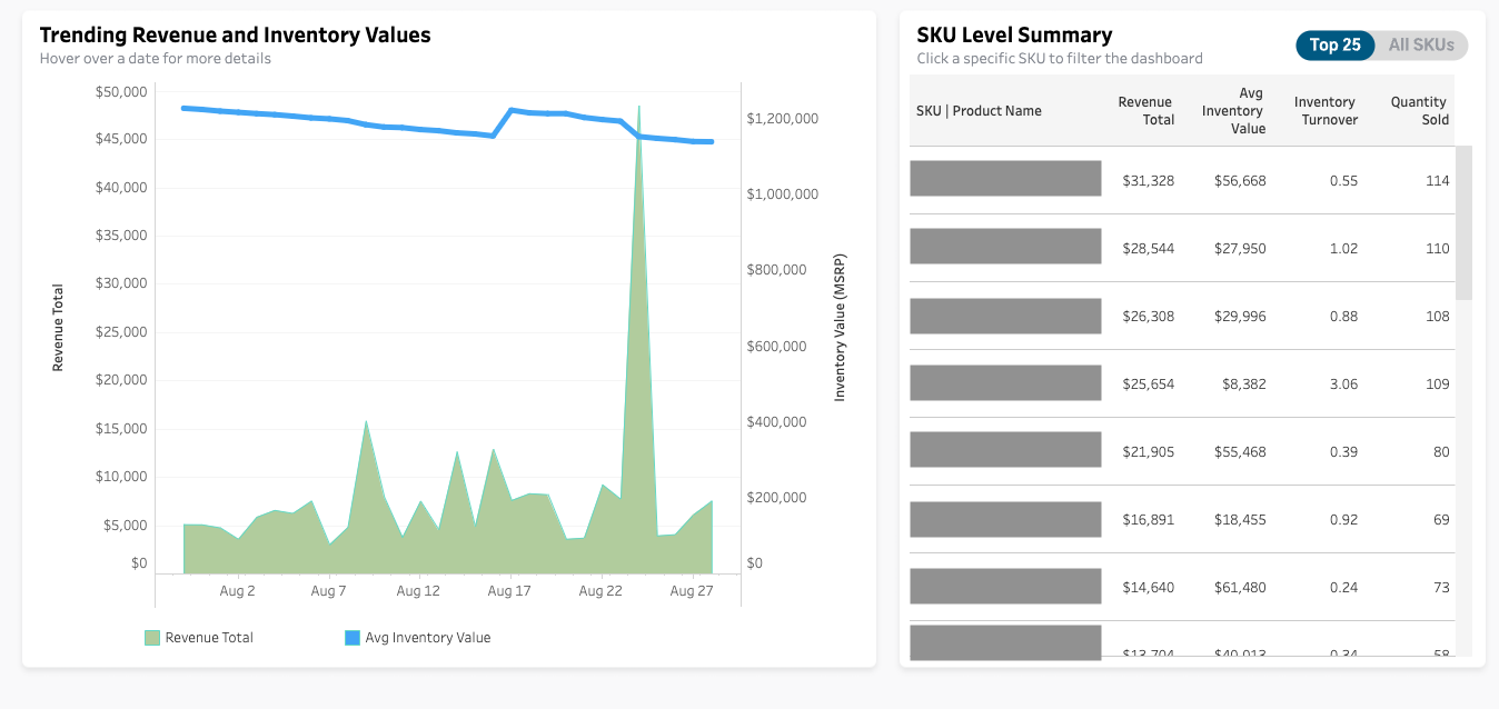
Trending Revenue and Inventory Values
The lower section presents a comparison between your actual revenue and your Inventory Value trend. To determine the Average Inventory value, multiply the stock on hand with the price of your items, and divide it by the number of time periods in your selected date range. This calculation helps you understand the revenue potential of your inventory. Ideally, the blue line, representing actual revenue, should be higher than the grey line, indicating your Inventory Value, indicating that you have enough inventory to meet demand without wasting money on excess inventory. This is a great opportunity to make use of the Optimize Inventory dashboard view.
Sku Level Summary
The right hand chart showcases top 25 skus across your product line. Each sku can be clicked on to act as a filter for the entire dashboard. Additionally, you can choose to look at all skus and not just the top 25 by utilizing the toggle in the upper right: Blue indicates the selected preference you have chosen.
These sku level metrics can be used to help you start in two directions from here, know we have specific dashboards for each of these types of analyses that should be utilized if you want to dive deeper.
- Optimize Inventory Levels: Average inventory value and inventory turnover metrics can help a business determine how much inventory to hold. If inventory turnover is low and average inventory value is high, it may indicate that a business is holding onto too much inventory, which ties up cash flow and can lead to excess waste. In contrast, if inventory turnover is high and average inventory value is low, it may indicate a need to increase inventory levels to keep up with demand.
- Improve Product Sales: By understanding the relationship between revenue, inventory, and quantity sold, a business can make decisions to improve a products sales. For example, if a business sees that a particular product has a high revenue total but low quantity sold, it may indicate that they need to adjust pricing to increase sales volume or marketing efforts to increase awareness of the product.