In this article:
- Overview
- Viewing Current Performance vs. Historical
- How to Identify Key Drivers of KPI Changes
- Running Total Comparisons
Overview
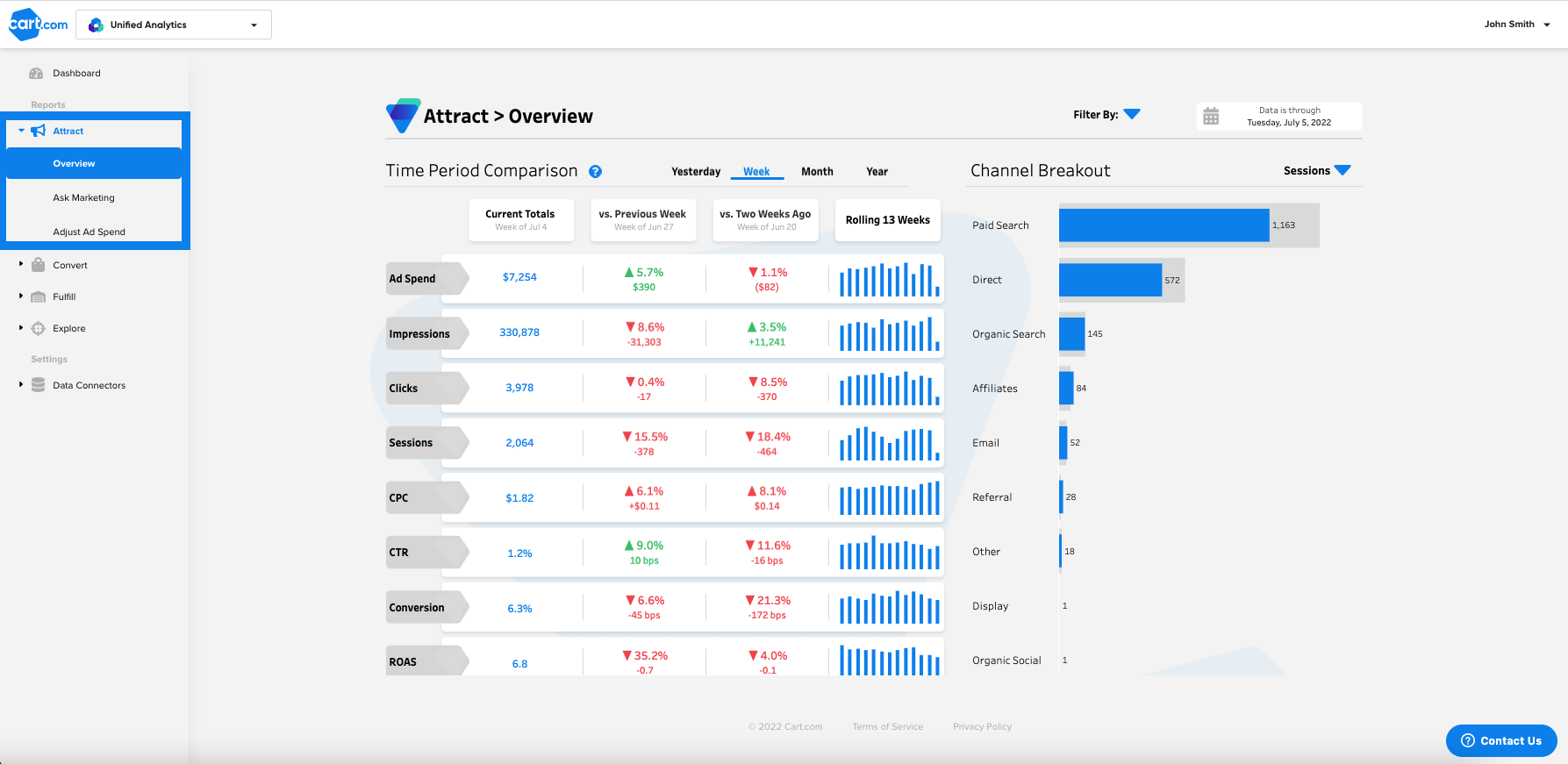
The Attract Overview dashboard gives an at-a-glance view of how all of your key marketing metrics are trending against historical performance by channel. You can find the Attract Overview dashboard by clicking here if you are logged into Cart Console, or by selecting the dashboard from the Attract section of the navigation sidebar:
Viewing Current Performance vs. Historical
The Time Period Comparison table shows current performance compared with the previous two periods to highlight growth or decline across eight of your most important marketing KPIs.
Marketing performance for the current period is in the first column, and the following two comparison columns show percent growth or decline of the current period when compared to a relevant past time period. In this image, the first row shows that ad spend has risen 5.7% compared to last week (a total rise of $390).
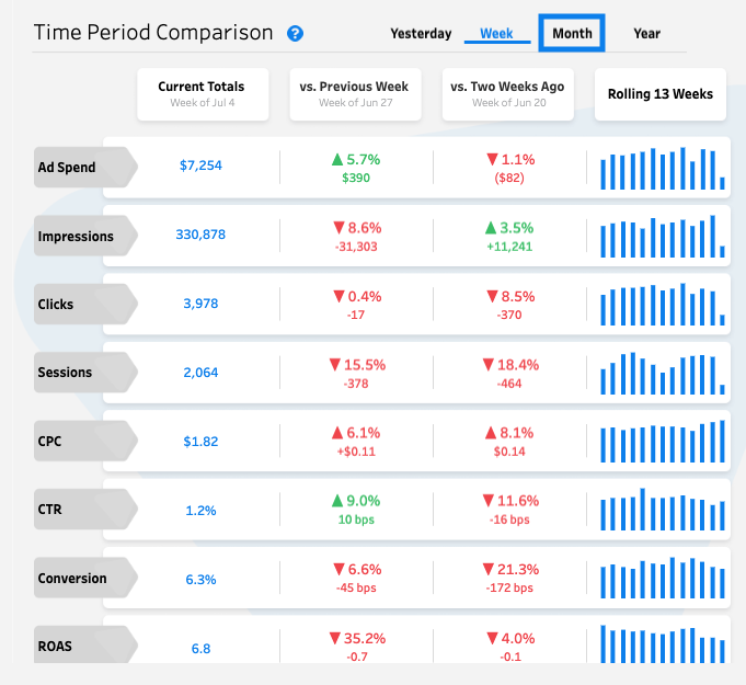
You can select the time period by clicking the tabs at the top of the table (see the "Month" tab highlighted in the picture above). Changes by week, month, and year are calculated as period-to-date comparisons. For example: if you are viewing Week and the most recent data is from Thursday, the previous period comparisons will also only be through Thursday.
How to Identify Key Drivers of KPI Changes
To identify which factors are driving your KPI changes, you can filter the dashboard by Brand, Channel, Platform, and Device:
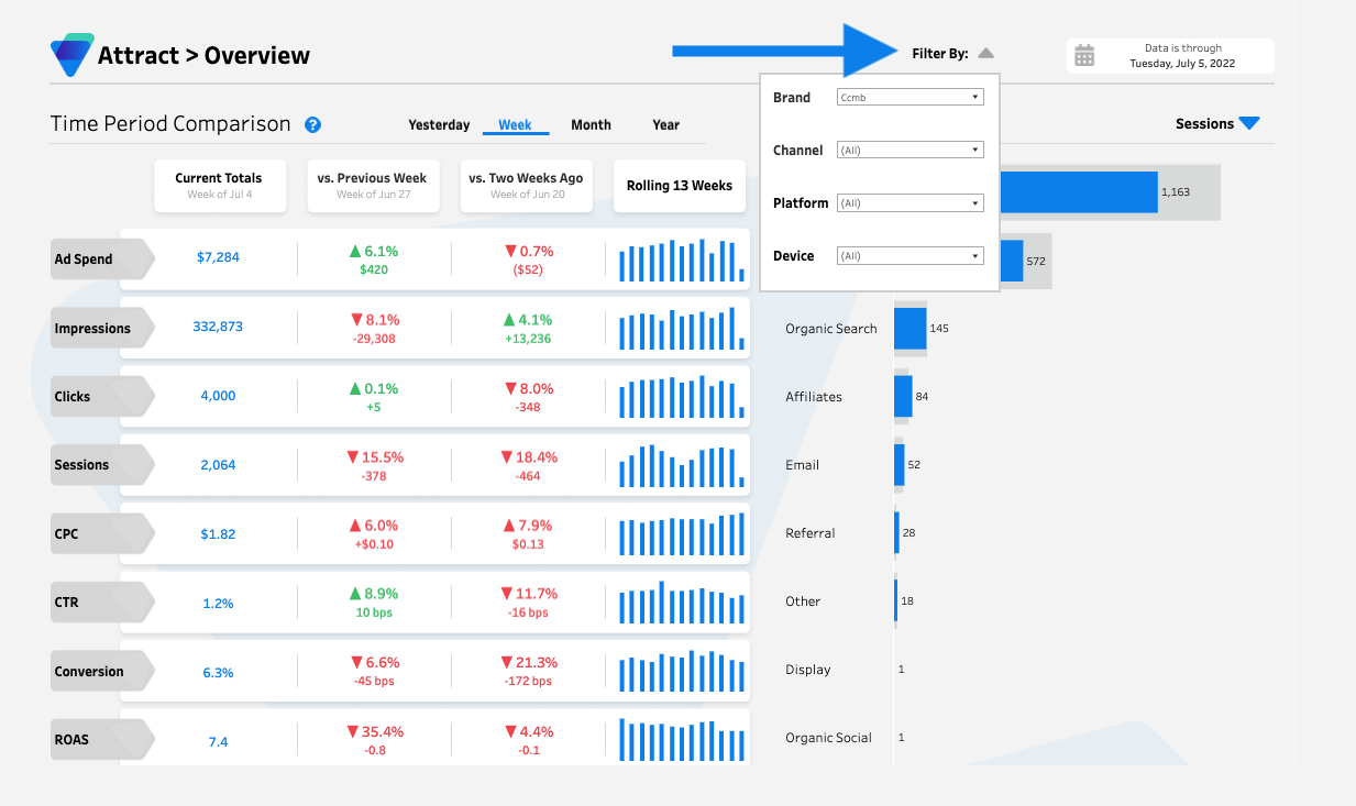
By honing in on specific channels and cohorts, you can see exactly how well each is performing to better understand what is driving your growth or decline. These filters apply across the whole dashboard.
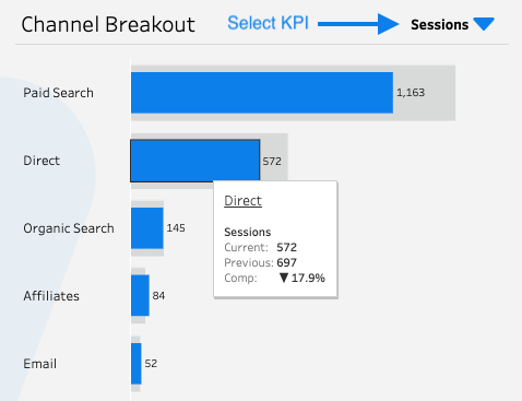
In the Channel Breakout, select a metric to compare performance across channels to identify which is driving the bulk of your performance. Current performance (blue bar) is plotted against the previous period (grey bar) for each channel. Hovering over each bar reveals the raw totals for the selected KPI:
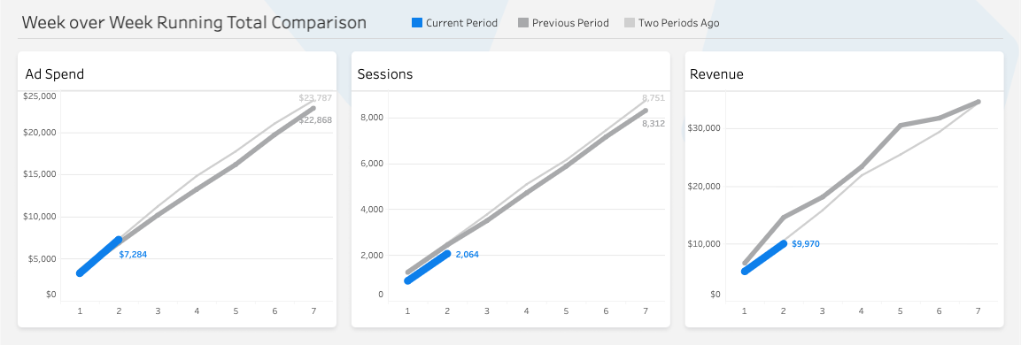
Running Total Comparisons
The Running Total Comparison charts at the bottom of the dashboard are there to provide business context as you analyze your marketing data. They visualize how your ad spend, sessions, and revenue are trending compared to previous periods based on the filters selected.